I like adidas Superstars a lot, even though I rarely wear them after overdosing on them a decade ago. When Woody asked me to write something about them for an anniversary project, I wrote too much. The edited down and tidied version is widely available elsewhere, but this is the one that will probably appeal to about seven people. But that’s what this blog is about, right? Factually, I still think a few points on source countries and dates of releases could be off (my searches for hard facts sometimes came up short). I waited six months or so after the launch to up this, and I couldn’t think of anything to write today on any other topic. Expect typos, a slightly corporate tone (it was partly written with official use in mind) and the occasional repetition. Most of the imagery was borrowed from adidas’s Archive resource.
Iconic is thrown around a little too much. You don’t seem to have to put a lot of work in to be iconic any more. Nowadays your face is iconic because you #amassed #lots #of #social #media #follows. Even your lunch could be iconic. But to be a real icon, you need longevity, not some throwaway, fast-food, buzzword attachment moment in the iPhone spotlight. The adidas Superstar’s 45 years as a favourite on the courts and into a whole heap of subcultures during its retirement from the game make it a strong contender for the finest design of its kind ever. It’s liable to still be relevant when it turns 100.
THE 1960s
Adi Dassler created adidas as a place to innovate and design shoes as equipment. The German location and basketball’s niche status in Europe during the brand’s early days meant that while you might see a deeply specific winter sport shoe, hardwood and backboards weren’t necessarily part of the plan. But how did the Superstar come to be? Anybody who studies the bloodline of their favourite shoe, knows that nothing appears from nowhere. A cursory glance at the state of shoes 50 years ago indicates that adidas weren’t even making basketball shoes until 1964, but the story runs a little deeper. Bear in mind that, in post-war Germany, there was American presence — that meant that a brutal-looking training shoe like 1949’s Trainingsstiefel boot became popular with the Yanks when it came to their game of choice. The hi-top adidas Allround training shoe from 1960 was also sold as the Allround Basketball around 1961 — typical of the time, many designs were sold as multi purpose pieces.
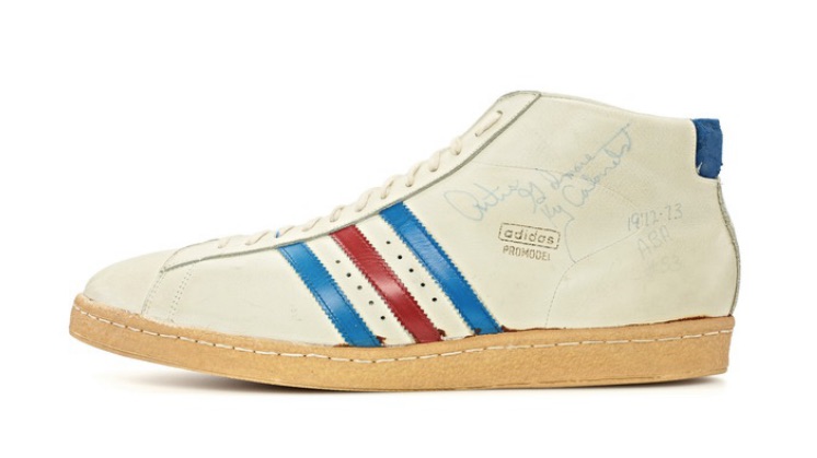
Leather shoes for the game were rare, and it was with American assistance that the Superstar and Pro Model would take shape. Barbara Smit’s Pitch Invasion revealed that an American distributor of adidas gear, Chris Severn, suggested the idea of the leather basketball shoes to Horst Dassler, and it’s also rumoured that the Severns were involved in the Stan Smith’s creation too. The Severn brothers brought adidas to the American market back in the 1950s, and eldest brother Clifford’s life story is impressive — a child actor born in South Africa and London raised who worked with plenty of movie legends during film’s golden age, and became a leading cricket player in Hollywood (alongside some of his siblings), before importing adidas track shoes in 1951. Clifford’s tight connection with adidas seemed to waver with a 1973 court case against adidas, but the legacy he and the family left for the brand is airtight.
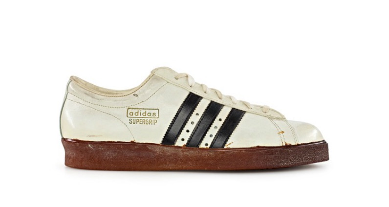
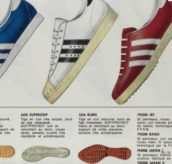
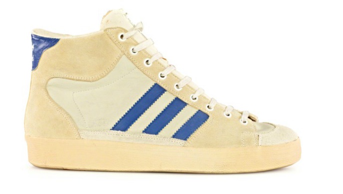
Around 1965, a shoe seemingly dedicated to basketball debuted — the Supergrip. With its herringbone pattern outsole and familiar silhouette, the simple looks were technical in their time, back when a cushioned heel, arch support, foam insole and padded ankle were state-of-the-art and Cangoran leather was the only way to go. Almost from its debut, the Supergrip was accompanied by the high cut Pro Model (the Pro Model would ultimately go under the one-word Promodel name as well, seemingly dependant on whoever was labelling the box or writing a catalogue on any given day) version of the shoe, minus a rubber toe — conformation that, despite being a different version, the Pro Model dropped long before the Superstar.


Shoes of the era were purely for their purpose and, as a result, would shape shift and be altered in line with new material technologies or discoveries. adidas was already experimenting with reinforced toes on tennis shoes because of the drag during play — spawned from the rubber-toed adidas Tennis, the Wilhelm Bungert signature shoe that arrived around the same time as the Superstar as a similar concept for a different kind of court, and the cult Tom Okker design would use a similar rubber wrap.
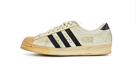
Those cautious early forays into basketball took a backseat to the groundbreaking running and soccer creations of the 1960s, but a French catalogue from 1968 includes an early sighting of a future classic — an illustration of a Supergrip with a familiar ridged rubber toe, in the handball and volleyball part of the publication (but with the same stitching as a regular 1967 Supergrip). That was nearly an early Superstar sighting, albeit under a different name. When the leather-tongued Superstar debuted (the name of the shoe’s original designer remains a mystery) and was tested by elite athletes in 1969, it brought the Supergrip’s SOFTPROTECT padding and soft leather, but the adjustable arch support, extra-large heel counter and shell-sole were pushed as selling points — the rugged rubber toe cap to take the abuse of stop and go movement looked unique, with ridges possibly added as a point–of-difference from other toecap creations.

The mysterious 1968 Supergrip with a shell toe
Since basketball’s canvas and rubber early days, the toe was covered to prevent the shoe being wrecked almost instantly, but applying it to the already resistant leather was something new. The Supergrip was still in catalogues, but retired to high school and college use with a budget price and a newly vulcanised, rather than stitched sole (it was sold alongside the vulcanised Greenstar basketball shoe that would evolve into the stitch soled Jabbar-endorsed Tournament shoe that would become the Campus — not to be mistaken with the late 1970s training shoe of the same name — in the early 1980s). This new creation was considered so serious, that some stockists would only supply them to those who had the correct accreditation for high school or college play.
1970s
Sold more widely in late 1970, and far from cheap, the Superstar and Pro Model were worn by top players like George Irvine, George Gervin, Rick Barry and Bob Verga. Kareem Abdul-Jabbar would become the face of that shoe (among others) when he signed a deal in 1976. Anyone wanting the colourways on some of those players’ feet was out of luck — some team colours on the 3-stripes were strictly for the professionals. With no wider releases and no auction websites to grab a pair from, collector culture was something of an anomaly at the start of the 1970s. The French made version — France being a significant base of operations for adidas under Adi Dassler’s son Horst — of the adidas Superstar became a new performance pinnacle.


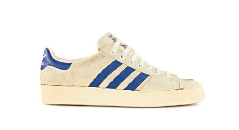
The adidas Superstar II and Promodel II
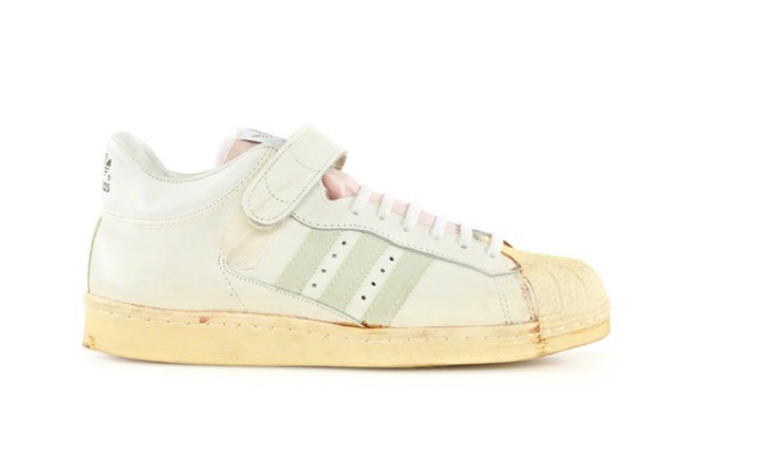
adidas never took the time to sit still — from a performance perspective, the game was changing. More dynamic play, the dawn of the dunk and an evolving version of the sport that justified more flamboyant footwear suited this Superstar, but adidas’s sponsorship of a league meant that they kept the pinnacle performance pieces coming. An easily rubbed off trefoil branding on the heel would be replaced by something embossed for a little more resilience. The Americana’s release in 1971 almost superseded prior triumphs — a breathable, brilliant shoe that replaced the rubber toe with a suede panel, and used the league’s patriotic looking blue and red. By 1974, the Half Shell debuted — officially naming the toe cap the shell toe, but offering a little less restriction than the classic Superstar. Spotted on feet in a handful of suede colourways, the Half Shell was frustratingly difficult to track down — as was its sibling, the Pro Model Half Shell. But the Superstar and Pro Model in more familiar forms, with gold branding on foam tongues, were visible in 1978 catalogues.
Around 1976, the Superstar II debuted, billed as a takedown of the Promodel II. That suede, half shell creation seemed to be in sales materials from that year until 1979. 1979 would be the year that adidas launched a premium-priced classic, the Top Ten, with some of the ten pro-level testers being previous Superstar and Promodel wearers. In a world before retro, the Superstar story should have ended there, but subsequent audiences wouldn’t let it die.
1980s
In 1980, catalogues included a subtly modified Superstar model they retained the classic looks but offered felt or leather stripes and an altered shape that seemed aimed at an American audience with its slightly wider fit compared to the narrower original. This version is considered the definitive edition by purists. It’s here that a gradually developing hip-hop scene in NYC gravitated towards this silhouette for its look, b-boy resilience in that forefoot, but crucially, the exotic otherworldliness of a European sportswear brand compared to homegrown staples. adidas had prestige. We can assume that here — despite some presumed uses of the term back in its basketball days — the Superstar truly becomes the “shell toe” (“shell top” is a commonly used term for the shoe too — whether it’s borne of a typo or a reference to the Pro Shell or Pro Model hi-tops remains unexplained). Production of this shoe would expand to Hungary early in the decade, as adidas France would make the most of a late 1970s manufacturing deal with Central European countries like Czechoslovakia to deal with demand.
In the South Bronx, the pioneers and party starters of the era were wearing them and giving them a street credibility that it never actively sought at this point in time. While the Promodel was still billed in a 1981 catalogue as a basketball shoe, the Superstar was pushed into ‘Indoor Court’ in favour of the Top Ten and Rebound designs. Its sporting days were numbered, but it was about to take on a new life. The quest for the ultimate profile — the stance and the attitude that defined the b-boy style was present in this design and with obese cotton laces left loose enough to allow for a little extra width, one of the longest-lasting elements of hip-hop’s wardrobe was adopted.


Photographer Jamel Shabazz’s snapshots of NYC street style where the glossy publications feared to tread in his Back in the Days book reveals the impact of this shoe among the sheepskin and Cazal wearing hood influencers of the time — a store window shot by Shabazz from around 1983 reveals that the shelltoe and Promodel commanded a higher price then than the Top Ten that once superseded them. The Superstar would find itself at the junction between New York’s Downtown and Uptown when cultures converged in the early 1980s — they’re visible in promo shots for Charlie Ahearn’s seminal 1983 fiction-meets-documention of 1982’s art-meets-hip-hop collision, Wild Style and they’re even spotted on Madonna’s feet, complete with red fat laces to match the stripes, back when she was a Downtown girl with ambitions.
In white/black, white/blue, white/red, white/green and white/white, the Superstar would flourish — while it wasn’t as expensive as its more technically advanced siblings, it was expensive enough to maintain a rep, staying out the budget lane to remain sought-after. Tales of Run-DMC and the shoe are well-worn, but the Queens boys bringing gold, leather v-panel goose down coats and barely laced shelltoes was a push into a more authentic street dress code in rap. Confirmation of the shelltoe nickname’s visibility beyond the ‘hood was present in the 1984 introduction of the Pro Shell — a new look for the Promodel that merged the look of the Superstar with 1983’s ankle strapped Concord, and a TPU moulded heel counter. Ads at the time (placed in a magazine targeted at an African-American demographic) include the Superstar next to the freshly released Pro Shell with the tagline, “The toe to know.”

In Japan, the adidas Superstar’s status was aided by a staggering price tag in the 1970s due to its foreign, European-made status. In the early 1980s it still cost a fair amount. The Plaza Accord of September 22nd, 1985, where West German, French, Japanese, British and American governments worked together to depreciate the U.S. dollar against the Deutsche Mark and Yen was important in allowing the shoe to become a little accessible — the Yen price of the Superstar was slashed by over a third as a result.
Lead times can take a great idea and make it lag a little. Run-DMC’s 1986 inclusion of My Adidas on the bestselling Raising Hell LP, a Russell Simmons’ instigated video demand to adidas for a million dollars and the Madison Square Garden call for attendees to hold their adidas aloft would result in a pioneering deal and a collection of Run-DMC apparel and footwear. Beyond the corporate involvement, it would also assist in instigating a 3-stripe boom in Boston, which became a city known for its love of the German brand over local heroes when it came to urban endorsement. Profile’s 1987 Christmas Rap compilation, with the crew’s Christmas in Hollis as the opener makes good use of a laceless shelltoe on its cover. 1988’s adidas Ultrastar was part of the Run-DMC line — a take on the Superstar with an oversized trefoil logo an elastic straps on the tongue to make laceless wear a little less treacherous. With Run-DMC’s popularity slipping a little between 1987 and 1988 when their Tougher Than Leather platter never hit quite as hard, the generation who’d supersede DMC, Run and Jay would opt for sneakers that were a little more ostentatious. So that was that, right? Not quite.
Back in Tokyo, by this point otaku-like levels of collector culture were already in place at this point when it came to shoes — DJs, skaters and journalists/renaissance men like Hiroshi Fujiwara, on his perpetual quest for authenticity, were hunting for French-made Superstars, like the black leather versions with a contrast white toe. As west coast surf lifestyle line Stüssy became white-hot, influential 1988 ads in the skate press included Superstars in the mix as a mark of an aspirational way of life. In London, the rare groove-led club nights that would birth acid jazz created an escalating appetite for “old school” footwear as a clubber’s staple. London trend-leaders and masters of capitalising on any nascent signs of cool, the Duffer of St. George made the most of it after a 1989 trip to NYC, where the store’s owners saw the London shuffler’s favourite on sale for knockdown prices — brought back en masse, given fat laces and thrown in the legendary store’s window, they shifted at a significant markup and helped fuel a trend.
1990s
What had been set in motion in the late 1980s would resonate harder in the early 1990s. That old school movement would hit the mainstream with a vengeance and just as the Superstar ceased its manufacture in France, it became an object-of-desire to the kind of people who sweat the details. The Beastie Boys — original shelltoe wearers — wore throwback adidas shoes on the cover of their 1992 Check Your Head set and the opening of the Mike D affiliated X-Large store in November 1991 on Vermont Street, Los Angeles would create the legend of an almost mythological “sneaker pimp” character sourcing deadstock basketball and tennis classic for the boys (and girls — hence the development of an X-Girl spinoff with Sonic Youth’s Kim Gordon involved) and a shelf of marked up European masterpieces in the store as a result.
Other important (and equally defunct as of 2014) stores like London’s Passenger and Acupuncture (a punk-inspired spot that harked back to a time when the Superstar was connected with Malcolm McLaren and Vivienne Westwood’s Seditionaries and World’s End) would trade in resold, French-made specimens too. Small town American newspapers even ran ads asking residents if they wanted to make some money selling attic-found Hungary and French-manufactured Superstars for up to $100 with Japanese fanatics (who’d pay four to five times that price) in mind.
Now for a spot of science — the original sole and toe of the Superstar were made from rubber injected with polyurethane. That meant the rubber was softer and non-marking, but clay fillers, calcium carbonate and magnesium carbonate meant that it would yellow in UV light, harden and crumble over time. Not so good for the collectors, as anyone who had a treasured pair dissolve on their feet or in the box can attest to. Nobody was expecting anyone to care 20 years on back in the 1970s. Subsequently, a new, purer non-marking rubber was introduced to the Superstar shell in the early 1990s
Around 1990, the Superstar II was birthed (followed by a Promodel II), with its altered shape, Asian-made status and extra padding. Throughout the decade and into the next, it was a bestseller in big chains globally. But there were still several China and Korea made editions of the early 1990s that retained a silhouette akin to the 1980s shape.
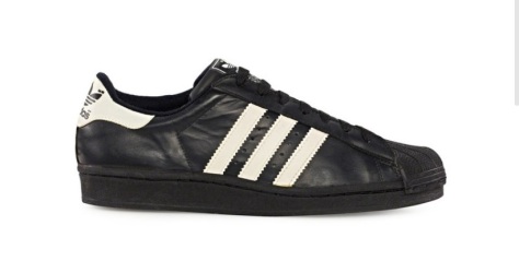
When former Nike staffers Peter Moore and Rob Strasser arrived at adidas in 1989 to shake things up, they’d been keen to place the trefoil in a trend category and create a line that would go on to be adidas Equipment that would be serious performance. In 1992 an early version of adidas Originals was created to respond to the appetite for classic shoes on the streets, with subtle tweaks for lifestyle wear — black Superstars with white stripes (officially solidifying it as a classic) and some other curious, but deeply appealing suede editions for foreign markets made appearances. In Japan, the steel-toed Safety series included reinforced versions of masterpieces with U.S. city names — around 1993, the Phoenix take on the Superstar made the forefoot protection aspect of the shoe to its logical conclusion.
On the skate side, street skating’s flip trick evolution created new cult heroes and an unpopularity that took it back to an outlaw era. Despite the rise of the skate-specific footwear brands and that anti-establishment mindset, the German-engineered Superstar became a photo and video fixture (voted one of the top ten skate shoes of all time in an early 2000s magazine feature) — skater’s skaters like Kareem Campbell, Keith Hufnagel, Carlos Kenner, Mike Carroll, Joey Bast, Drake Jones (who pretty much skated every great shoe, even ACG hiker boots), Chris Hall (also the shoe connoisseur’s connoisseur) and Mark Gonzales skated in the Superstar and Promodel, benefited from the extra longevity and protection the toe provided. It helped that the hotbed of skate innovation, San Francisco, was home to pioneering adidas retailer, Harput’s on Fillmore Street.
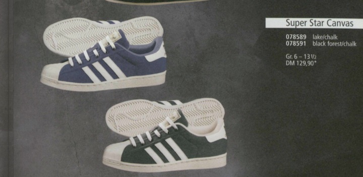
By 1996, adidas was targeting the skate market more directly, running ads in the skate press featuring Josh Kalis. Signing Superstar wearers like Gonz and Quim Cardona, the connection with the culture was made contractual. Oddities cropped up in the press too, like the unusual double-tongued Canvas Super Modified version of the shelltoe from 1997.

The 1997 Originals catalogue, complete with a kick flip in motion on the cover, includes some more ambitious versions of classics — canvas and patent leather Superstars (following up the previous year’s ridge-soled Superstar Ripple remix) are in there alongside the return of the Ultrastar.
As a testament to the Superstar’s versatility, as hip-hop split into two distinct schools-of-thought (both reunited in a post-Kanye world), with the throwback b-boy look representing a certain purity and the shinier, recognisable samples driving music that turned a culture into a billion dollar business, the Superstar was the shoe of choice. Puritans rocked the shell and Jay-Z and Puff Daddy (pre-Diddy) wore the white on white versions too, respecting the cleanliness and, as veterans of the industry who saw the shoe’s original impact with hustlers and MCs alike, understanding its importance. Love it or hate it, but the rap/metal ‘nu-metal’ crossover of the era, fronted by bands like Limp Bizkit — and always acknowledging the path trodden by Run-DMC’s hip-hop and rock experiments — made the Superstar a key element of the scene’s uniform too. Wallet chains were optional.


As the 1990s drew to a close, the Superstar’s presence was strong, offered in the Superstar Metal (never one for the purists) with those gleaming eyelets and a non-metal variation (now with added lace jewels), and upgraded for adidas’s performance category as the mid-priced Superstar Supreme and Millennium Supreme, with a sleeker upper and modified sole unit. For a crossover into a new century, the 1969 look was still getting buckets in high school gyms. Now that’s some serious stamina.
2000s
By this point it was probably safe to confer icon status on the adidas Superstar, but with a sneaker collecting culture expanding beyond a small group of diehards on forums and newsgroups into something with global reach, despite the year 2000 sounding like an era of pure progression, an obsession with retrospect meant that the reissued shoe became popular currency. Your big brother or older cousin’s favourite was now a younger generation’s shoe choice due to some smart decisions from brands noting a cult become a force to be reckoned with. Those looking for shelltoes could grab some Superstar II shapes with some versions with snake stripes in white or a scarcer black colourway, or pick up a red and blue striped tribute to the Americana. In 2001, adidas Originals was officially launched as a division of the brand rather than the smaller project of the early to late 1990s — soon, the folks complaining about the alterations in quality, shape and fit would get something more relevant to their interests, provided they were willing to queue for it. A Lux version of the shoe would even give it a semi formality, with a crepe sole edition following it that used similarly premium materials.
On court, the Superstar 2G and Promodel 2G superseded the Superstar Supreme and became the shoes of choice for plenty of future legends (LeBron James being one such fan) during their high school days. Frequently name checked by athletes during consultancy sessions for its formidable comfort, the Superstar 2G is considered one of the finest hoops shoes of the early 2000s, with elements of it present in several other models of the time. 2004’s A3 Superstar Ultimate built on the legacy, but was barely recognisable as the shelltoe’s offspring.
On October 30th, 2002, Run-DMC’s Jam Master Jay passed away. To mark his contribution to the culture and the enduring popularity of shoes with a shell, adidas released the JMJ Ultrastar in early 2003, with proceeds donated to the Jam Master Jay foundation.
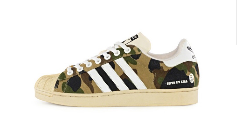
As a pivotal part of Tokyo’s Urahara movement, Nigo understood the power of the Superstar back in the 1980s. before he launched his A Bathing Ape brand in 1993. Ten years later, an introduction to adidas’s Gary Aspden via Ian Brown to his friend, BAPE’s Kazuki Kuraishi (who’d go on to launch his own ObyO line with adidas that incorporated some Superstars) led to the development of the adidas and A Bathing Ape collection of Superstars and Superskates with premium build, custom packaging, careful marketing and low, low numbers. This was a restorative affair too, following Nigo’s keen eye for what made the shoe great — the SUPER APE STAR used the original tough chrome leather rather than the garment tumbled leather used at the time, raised the heel and used a vanilla dye in the toe rubber formula to reproduce the yellowed effect of a vintage pair.
Sold via select stockists worldwide, the shoes caused queues — a rarely seen sight beyond Asia for footwear — and the dreaded resell rate for those who weren’t willing to sleep rough or set their alarms earlier. With the project slogan, “The respect is mutual“, the adidas BAPE release remains pure in its organic creation, meticulous execution (a hallmark of Nigo’s brand and a nod to the Germanic origins of the shoes) and a genuine fandom from both parties. This was less a business model and more a love letter to a masterpiece.

A careful drip-feed of icons would follow — fabled Half Shell would get a reissue too, and with adidas Skateboarding getting a bigger push under the Originals banner, Mark Gonzales would get his own Superstar (a skate-specific Superstar and vulcanised version would arrive later in the decade), but post SUPER APE STAR, it was clear to the brand that an impending anniversary year for a flagship shoe would be an opportunity to make an even bolder statement.
In 2005, to mark the 35th anniversary of the Superstar (working on the principle that it actually hit the market in 1970), the ambitious Superstar 35 programme was unleashed. 35 years, 35 shoes. It began with fanatics queuing outside a handful of boutiques on December 31st, 2004. While the rest of the city was in full revelry mode, the midnight chime signalled the sale of the Consortium collection — a pioneering combination (spearheaded by Aspden) of top-tier doors given free rein to rework an accurate remake of the original 1969 Superstar — the Superstar Vintage — that was built to the original specs through dissection, trial and error. Limited to just 300 pairs of each, it made sense that the #1 had to be Adi Dassler himself, with his face on the heel of a reproduction of a true adidas original. London’s Footpatrol, Hamburg’s Tate, LA’s Undefeated, New York’s Union, Tokyo’s Neighborhood and Hong Kong’s D-Mop. It’s notable that several partners opted to use the contrast toe effect beloved of skaters, b-boys and Japanese collectors decades prior, and as the year began, they were gone. Ten years on, it’s still an oft-imitated way to set off a shoe, but here, it was unique — almost disorientating, with hype blogs still in their infant stages and no social media to get a heads-up.
The Consortium hit would be followed by a pop culture riffing Expression Series, limited to 4,000 pairs of each and using the Superstar I silhouette, with Andy Warhol, Captain Tsubasa, Lee Quinones (a clear nod back to Wild Style), Project Playground, Disney, adicolor and Upper Playground. Then a Music Series, limited to 5,000 pairs of each Superstar I, with Run-DMC, Ian Brown, Red Hot Chili Peppers, Roc-a-Fella, Underworld, Bad Boy and Missy Elliott all involved. The Superstar II shape would be used as the base for a Cities Series and Anniversary Series. That made up 34 shoes.
The adidas Superstar #35 is a rare shoe. It was made in barely there quantities and used as a prize in Berlin, London, New York, Los Angeles and Hong Kong treasure hunts and never went in sale, Handmade entirely from leather, down to the shell and outsole, it was presented in a leather-covered case with gold-plated hardware that included an equally plush cleaning kit with the shoes. Never officially for sale, this was a luxury celebration and migraine for anyone who’d spent the last few months frantically amassing the other 34 editions.
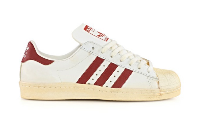
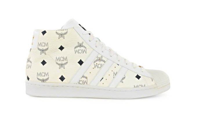
In the years that have passed, the adidas Superstar has been fuelled by the post-Superstar 35 effect — the Superstar Vintage and a Promodel Vintage would get a wider release and the off-white authenticity that Nigo’s vision necessitated is frequently used to resurrect archive looks. The collaboration is now a norm in a world of limited editions and an explosion of collector culture. In 2008, adidas Originals would put out a missing piece of the Superstar story — a reproduction of the French-made 1980s shape called, fittingly, Superstar 80s, complete with felt stripes. Partners like CLOT, FTC, Alife and Kazuki have partnered up for more interpretations (when German luxury legends joined forces to rework the Promodel in 2006 worlds collided beautifully). Everything works in cycles, but even with a multitude of variations, countries of origin and collaboration, there’s still a thousand other tales to be told. Is there a fair argument for declaring this to be the greatest sneaker design of all time? Absolutely. It’s not just the numbers you shift or the digital traffic you herd — it’s about the impact a simple shoe can have on popular culture.